MARYANDRES
Problem
When the platform was unavailable, users were shown
a system-generated maintenance page filled with technical language and no actionable guidance. This created confusion, increased support requests, and left users unsure of what to do next.
CLIENT
FORTIFY
A major exterior building products manufacturer that provides metal roofing, wall panels, and pre-engineered building products to contractors, builders, homeowners, and commercial clients nationwide.
Outcome
After implementation, support tickets related to outages decreased by 34%, and qualitative feedback showed users felt more informed and less frustrated during downtime.
INFO
Role
1 UX Designer
Timeline
4 Weeks
Team
1 UX Designer
1 Product Manager
1 Engineer
1 QA

UNDERSTANDING THE PROBLEM
Why are we doing this?
1
No Audience Connection
If a user is in the middle of pricing a project or racing to submit a bid before a deadline, having the site suddenly go down with no explanation can be stressful and disruptive.
Without any context or guidance, users are left unsure whether to wait, refresh, or start over, adding unnecessary frustration at a critical moment.
2
Perceptions of Unreliability
When a site goes down without any explanation, users don’t know whether the issue is temporary, how long it will last, or if their work has been lost.
This uncertainty weakens trust, especially for users working against deadlines, because the system appears unpredictable and unsupported at critical moments.
3
Unclear Next Steps
Users are left with questions like why is this happening, how long it will take to fix, or what they should do next— and are unsure whether to wait, refresh, or redo their work.
Users shared their experiences and feelings that the system is unreliable and stressful, especially if they’re on a tight deadline.
DATA & METRICS
Understanding the current experience
The current design is quick and simple, based on a legacy feature, to quickly unblock development and minimize scope.
During a periods of unplanned maintenance, customers were unable to access the system when they needed it most. This caused delays in preparing and submitting quotes.
Many teams paused work or relied on manual processes, which added pressure and frustration. Others facing strict deadlines turned to competitor software as a last resort.
40%
System down and access issues
“We can’t log in at all.”
“The page just keeps spinning.”
“Is the system actually down?”
25%
Lack of communication/status updates
“When will the system be back up?”
“Where do we check the system status?”
“There was no warning—what’s going on?”
15%
Deadline and Bid Urgency
“We planned our whole day around this.”
“We’re going to miss the bid deadline.”
“This is a six-figure job we could lose.”
HYPOTHESIS
We decided to create a user-centered maintenance page with simple language, expected downtime, and alternative actions users could take.
UX RESEARCH
Supporting customers with best practices
Most maintenance pages use
Personalized language to create an emotional connection by making users feel like the maintenance was designed with them in mind.
Strong branding to promote professionalism, providing users with instant confirmation that the website is actively managed, and the downtime is temporary, ensuring trust and reducing frustration.
Apple
-
Strong branding
-
Simple messaging explaining the outage

Facebook
-
Empathetic/user-centered message
-
Information explaining when service is expected
to be restored -
Specific call to action to guide users


Slate
-
Clear messaging about why the downtime
is happening -
Provides specific time period for when the
maintenance should be complete
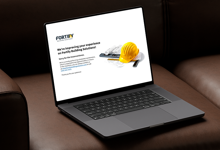
DESIGN RECOMMENDATION
Supporting customers with best practices
Explanation for Downtime
To make it easier for customers to understand the lack of availability
Estimated Time of Return (ETA)
To help customers maximize their schedules
.png)
Call to Action for Support (CTA)
To help customers understand what to do next
-
Strong brand logo provides instant recognition reducing users fears that something is broken
-
Headline clearly explains the interruption and benefit to the user
-
Message includes the reason for the interruption while CTA’s guide users to next steps
-
Engaging image encourages confidence in the ongoing work and expected outcome
INTERATION 1
Immediately understand the outage
A light friendly visual is combined with the brand logo, a clear message and CTA.

INTERATION 2
Humanize the experience
After testing both designs it was clear that customers preferred a real image. It communicates the professionalism of the brand.
"A real system, managed by real peope, working for real results."

RETROSPECTIVE
Final Takeaways
The redesigned maintenance page received an immediate positive response and was adopted across other
e-commerce sites.
Communicating with customer support and customers was critical for understanding the direct impact that outages have on perceptions and for guiding improvements that protect trust and customer satisfaction.