MARYANDRES
An easy and reliable way for small-scale property buyers to learn about the local market.
.png)
CONCEPT PROJECT
ROLE
Sole UX/UI Designer
DURATION
8 Weeks
DELIVERABLES
User Research
User Interviews
Competitive Analysis
Wireframes
Prototypes
Usability Tests
Prospects
Providing Convenience and efficiency
Real estate investing can be an exciting and emotional experience, but often complicated. Buyers who are new to the market may struggle to get started without professional guidance and waste time viewing properties out of their range.
I helped Prospects to personalize and streamline the online search process for people wanting to purchase their first investment property. I did this by incorporating a progressive onboarding, advanced sort and filter options, and an engaging visual design.
Empathizing with buyers
Understanding user/customer needs
Prospect’s targeted users for the mobile app are small-scale property buyers looking to invest for additional income or financial security. They consider the search process to be long, nerve-wracking, and overwhelming.
Prospective buyers often spending a lot of time and effort traveling to different locations to find the right property. I also learned that buyers have an increased anxiety that a lack of information will result in overbidding, overpaying, or a negative cash flow.

Activities & Outputs
User Research
Affinity Mapping
Miro Discovery Doc
Translating feedback into functionality
Analyzing the research
I conducted a user survey and interviews to understand what goals people had for investing in real estate, how much time is spent searching for properties, and challenges experienced. After completing a competitive analysis of both direct and indirect competitors, I identified 3 key features to study: onboarding, navigation, and filters.
Then created a user flow to illustrate three different paths a user might choose to retrieve a list of properties that match their preference.
-
Log In/Sign Up
-
Searching and viewing
-
Evaluating property details
Activities & Outputs
User Research
User Survey
User Flow

5 User Inteviews
Structuring the content
Conceptualizing the design
I transferred my ideas from sketches to wireframes, then worked through potential solutions for the navigation, page structure, and layout. This also helped me to have a better understanding of content placement and what the interface could look like.


Activities & Outputs
Sketches
Wireframes
Journey Mapping
Establishing a strong brand
Working with the visual design
Purchasing property is a big decision that carries a considerable financial investment. Buyers want a brand that they can trust. I created a design system that I felt would effectively promote customer trust and brand loyalty.
Fully understanding the problem and user's intentions, helped me to strategically place UI elements to establish a consistent, predictable and reliable experience.


Activities & Outputs
3 Mood Boards
Design System
Optimizing the search
Retrieving results faster
With so many property listings users need transition to relevant information quickly. A clear search function, the option to save and revisit recent searches, and the ability to easily sort through extensive property lists aid buyers in finding properties that fit their criteria.
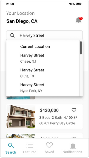
Explicit Search
The search bar displays prominently at the top of the page. Auto-complete will surface
a set of possible results. Users can click the magnifying glass to see the results displayed below the search bar instead of on a different page.
.png)
Saved and recent searches
Saved and recent searches makes it easier for users to select from previous searches instead of retyping the same keywords or search criteria.
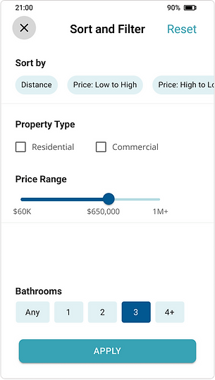
Sort and Filter
The sort and filter options are consolidated into one page to account for the large data sets that will be pulled from the extensive database. A tab navigation allow users
to switch quickly between categories to further refine their search.
Learning from Users
Identifying improvements
Once the initial design was complete, I conducted usability test with 12 participants. The feedback from the usability test was used to redesign 3 key areas: profile set up, searched/featured properties
1 – Profile Setup
A Steps Left pattern was added to the profile screens to let users know how long the Profile Setup process is. This was added to increase motivation for continuing on to the search process.
.png)
2 – Search Results & Featured Properties
The size of the property cards was increased to create more white space and improve scanability. This adjustment was also made so that user can switch between devices without experiencing breaks in the design.
%20(1).png)
3 – Notifications
Users were concerned that they would miss important notificiations. A notification icon was added to the top of the screen to provide a timely alert with out being distracting. A link to notification settings was added to the profile menu to provide users with control over the types and frequency of notifications.
.png)
Activities & Outputs
User Testing
Less really is more
Lessons learned
An abundance of features does not result in a better user experience. It was tempting to add in more more visual elements and to continue increasing the appeal of the design but I realized that it would also add layers of complexity. What mattered most was that users are able to get to relevant information quickly. As I learned more about their perceptions and challenges, I ensured that the final solution met their needs and added value to their process.
.png)
.png)